Tuesday 28 May 2013

Freelance - lgbtmentalhealth.ie - Concept & Development

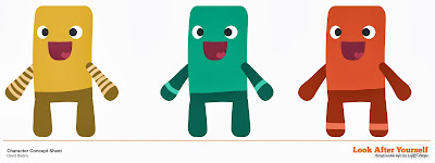
The client asked for a character which would be genderless and to an extent ageless. The video is supposed to appeal to everyone in the LGBT spectrum and therefor had to be non-specific but yet relateable. I wanted to go down a similar path to the 'Dumb Ways to Die' video by using characters which would normally appear in a children's animation but had a message intended for adults. Even with a simple design I wanted to go about it the right way by starting with character thumbnails. I used a technique I saw recently on youtube where the artist was working on character thumbnails for Thorin Oakenshield, albeit a very simplified version of it. After deciding on a set of silhouettes, you copy them a number of times and force yourself to try many different variations. You then work back into them with white to establish the details.


After choosing this character I recreated it in vector format (again in Photoshop, not Illustrator) and mocked up a couple of colour and shape variants. Creating the character this way means I was almost ready to import into After Effects and start rigging, only the multiple mouths needed creating.


I created the storyboard concurrently to the character design, although the character can change, it doesn't really matter too much if the model is slightly different in the boards when you animate (unless of course there are extra limbs or something like that).


The character did in fact end up changing, sometimes you don't really see these things so it's great to have another pair of eyes, but the character was a bit like a chicken drumstick or a pigeon so it was decided to go back to the thumbnails - this is where having thumbnails and showing them to the client pays off - they can see your 'working out' and can pick another of your ideas that you may have perhaps dismissed.


And there you have it - as I mentioned in my last post - the stripes on the arms were lost in the end and the 'trousers' were changed to 'socks'. I found the short bodies somewhat limited when animating, they didn't have really any articulation in the waist. I was able to get better results with 4 pins on the character rather than 3 (which I used in the first video) but any large movements of the pins led to some pretty ugly distortions of the rectangular body. The biggest 'warp' I was able to get away with was in video 1 when the purple character gets on tip-toes and blows away the cloud.


Freelance - lgbtmentalhealth.ie - Video 3


The final video was a lot easier than the second - although there are multiple characters, thankfully they are dancing, which means I was able to use looped keyframes. I also felt the background elements really fit with the characters here, I committed 100% to flat design - there isn't any perspective or depth but I felt comfortable leaving it out in this case (even video 1 had a 3D park bench). There was one scene which was cut, but that was my fault for getting impatient and skipping the storyboard phase for this video. I was very eager to get straight into animating!

The initial character design for all of the final video is slightly different to the original approved design - the characters initially had different stripes on their arms and legs which gave them more individuality, but it also meant that each character had to have it's own .psd - whereby with the new design, I ended up only using one of the .psds and using a fill effect within After Effects to change the colour of each layer. This also had the added advantage of being able to cut and paste poses or occasionally (as with the walk cycle) entire sections of animation which could then be tweaked to fit.

Freelance - lgbtmentalhealth.ie - Video 2


This video was technically a lot more complicated than the first - I did struggle initially on how to construct the cycling scene - I wanted to stay within the confines of the flat design aesthetic, but I also wanted to get the feeling of movement and depth in there too. I ended up using two layers in addition to the staggered placement of the characters so I could create the parallax effect without adding (I hope) too much detail. I think I kind of broke the rules with the lens blur on the trees because that technically left me without the nice clean edges, but in the end I justified it as being no different to motion blur, which is definitely OK.

In addition to the depth of the cycle scene, this video was also more complicated due to the appearance of multiple characters - the script necessitated a family interacting around a dinner table. Once I thought about the placement of the characters, (opting for the classic single-camera setup) it all went rather smoothly.

Freelance - lgbtmentalhealth.ie - Video 1


I recently completed a long project for GLEN and BeLonG To Youth Service on behalf of the National Office for Suicide Prevention. It was the first time I have handled an entire project from start to finish. Initially I was asked to do the script but in the end it was handled by the client. With that exception I took care of finding the music, the character design, asset creation and finally animation and editing.

I really took a lot of pleasure in investigating the style based on the clients description, my previous work for the Freshly Squeezed 2012 Promo was citied as a good example of the kind of humour, and Dumb Ways to Die by Metro Australia in terms of visual style. I spent some time analysing the simple design approach and for the first time found a name to describe it - flat design. Following those design principles was great for a number of reasons - aesthetically, but also technically: The flat colours and lack of gradients meant that my meagre machine was able to comfortably handle puppet tool animation with ease (my previous experience of animating using this method has been slow and oftentimes frustrating) - it meant that rather than separating the limbs at the joints and posing the characters by rotation and parenting I could now really play with squash and stretch and get a nice organic feel to the animation. Not only this but the render times in the beginning were relatively fast even with motion blur. (Later when creating the second and third videos I kept them all in the same project file to allow me to easily share assests without importing other projects and risking duplicated compositions, which was a good move but ended up increasing the render time.)

I am very pleased with the project, it was really a great opportunity for me to get back into character animation - something which I haven't done on this scale since working on 'I'm a Monster!' in Dublin in 2011.

Friday 17 May 2013

Freelance - starlitjewellery.com 20 sec Advert


This was the second attempt which was gladly accepted. This advert aired on TV3 in Ireland over Christmas 2012.

Freelance - starlitjewellery.com 20 sec Advert - rejected


Another advert here. This is the first attempt at a 20 second advert for online Irish-based jewellery store - StarlitJewellery.com. I don't share client feedback unfortunately, but needless to say it wasn't stylish enough.

Freelance - onandgone.ie 10 sec Advert


It's been a long time since I've posted anything - I've been so busy freelancing, I haven't had the time to keep up with the blog, so there will be a bit of a backlog of posts where I will try to share what I can considering some of these will be corporate videos etc. so I cannot show them in full.

Here is a 10 second advert which I created for Setanta Ireland on behalf on onandgone.ie, an auctioning website in Ireland. This advert aired on TV3 over Christmas 2012.